Detecting clouds and clear skies (part three)

Last time we saw how we could take the the results of our cloud sensor data set and explore them using a Jupyter notebook.  Typically you use the notebook to implement the data science part of your projects but once you have the notebook ready, how do you run it automatically on a schedule?

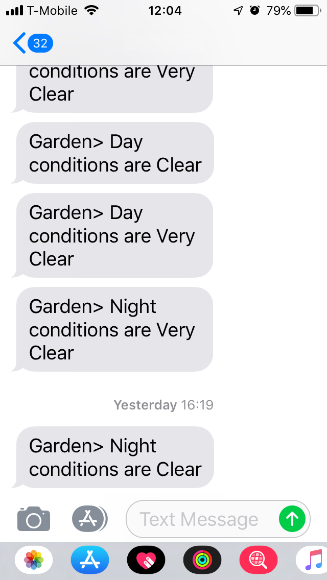
First let’s start with the data science we would like to do. I’m going to do some analysis of my sensor readings to determine if it is night or day and if the sky is clear, has low or high cloud, or it’s raining (or snowing). Then, if conditions have changed since the last update, I’m going to publish a message on an SNS topic which will result in a message on my mobile phone for this example.

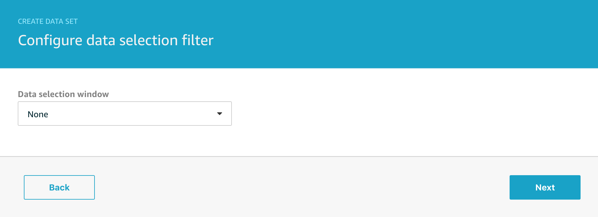
The first new feature I’m going to use is that of delta windows for my dataset.

In the last example, I scheduled a data set every 15 minutes to retrieve the last 5 days of data to plot on a graph. I’m going to narrow this down now to just retrieve the incremental data that has arrived since the last time the query was executed. For this project, it really doesn’t matter if I re-analyse data that I analysed before, but for other workloads it can be really important that the data is analysed in batches that do not overlap and that’s where the delta window feature comes in.

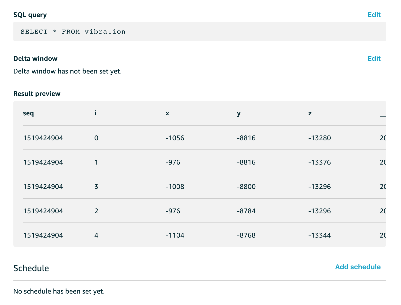
We will edit the data set and configure the delta time window like this;

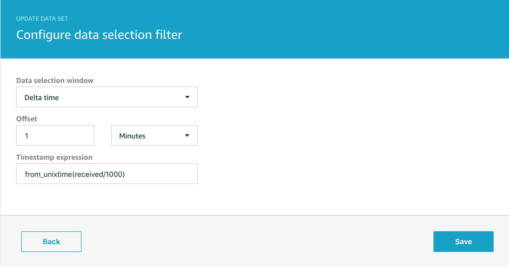
The Timestamp expression is the most important option, IoT Analytics needs to know how to determine the timestamp of your message to ensure that only those falling within the window are used by the data set. You can also set a time offset that lets you adjust for messages in flight when the data set is scheduled.

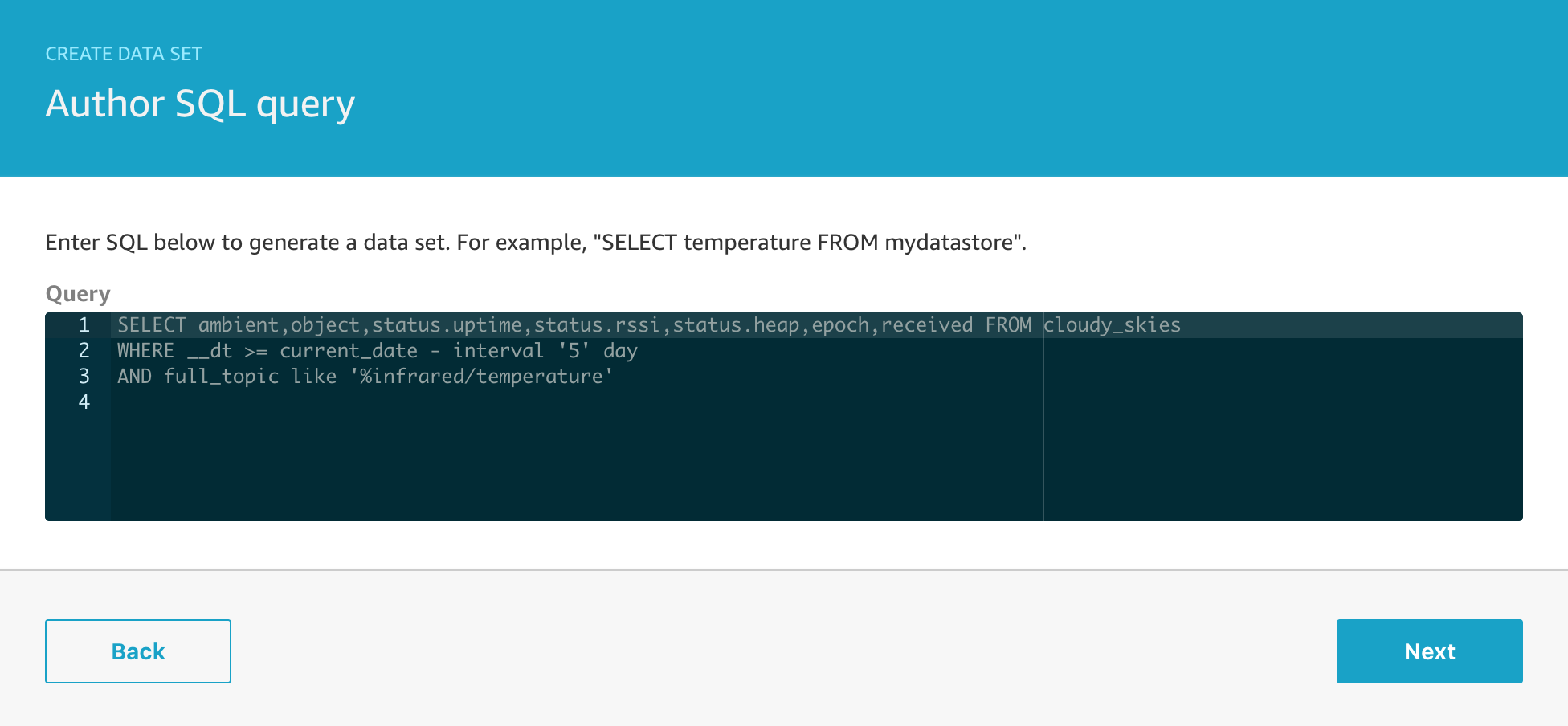
Note that my Timestamp expression is;

from_unixtime(received/1000)

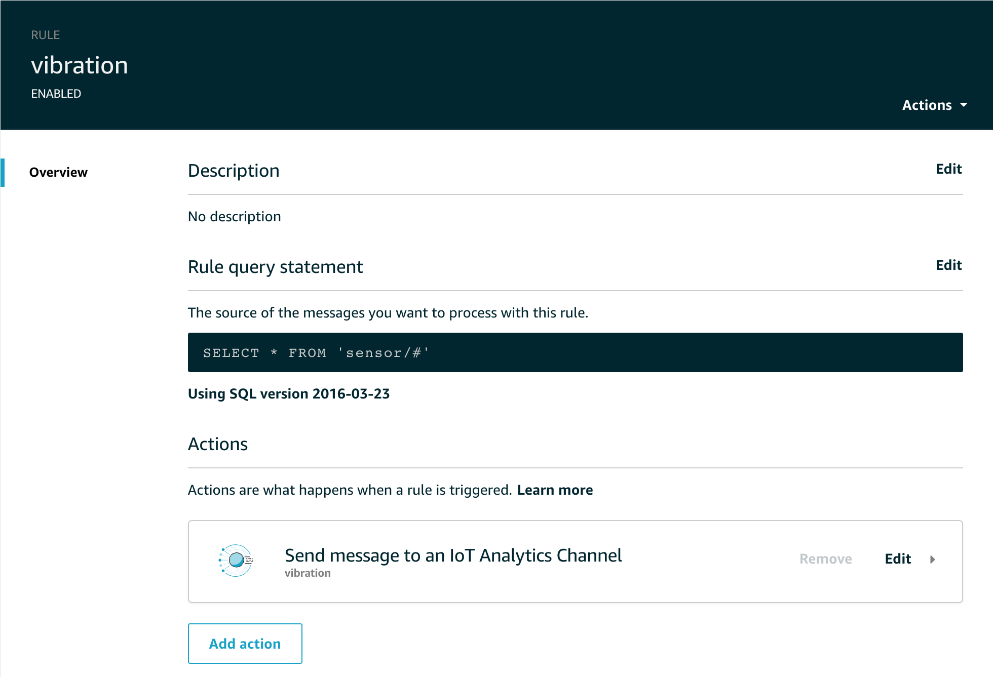
In many of my projects I use the Rule Engine Action SQL to add a received timestamp to my messages in case the device clock is incorrect or the device simply doesn’t report a time. This generates epoch milliseconds hence I’m dividing by 1000 to turn this into seconds before conversion to the timestamp object.

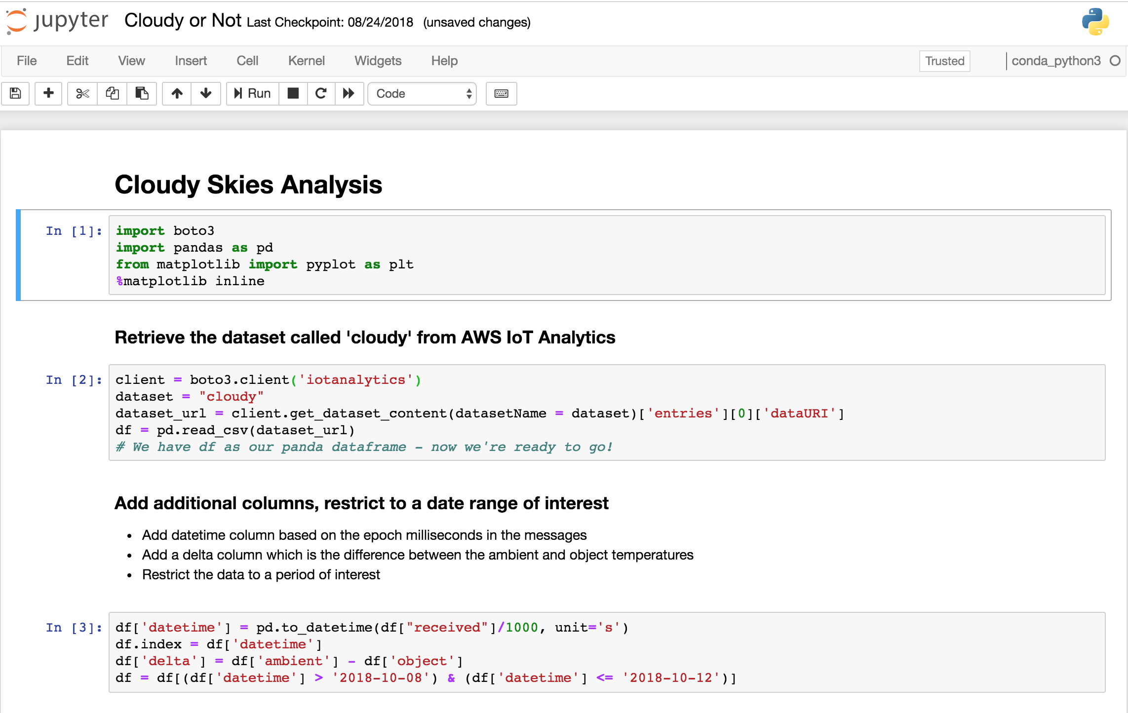
We’re going to make some changes to our Jupyter notebook as well, to make it easier to see what I’ve done, the complete notebook is available here.

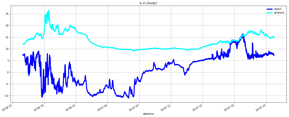
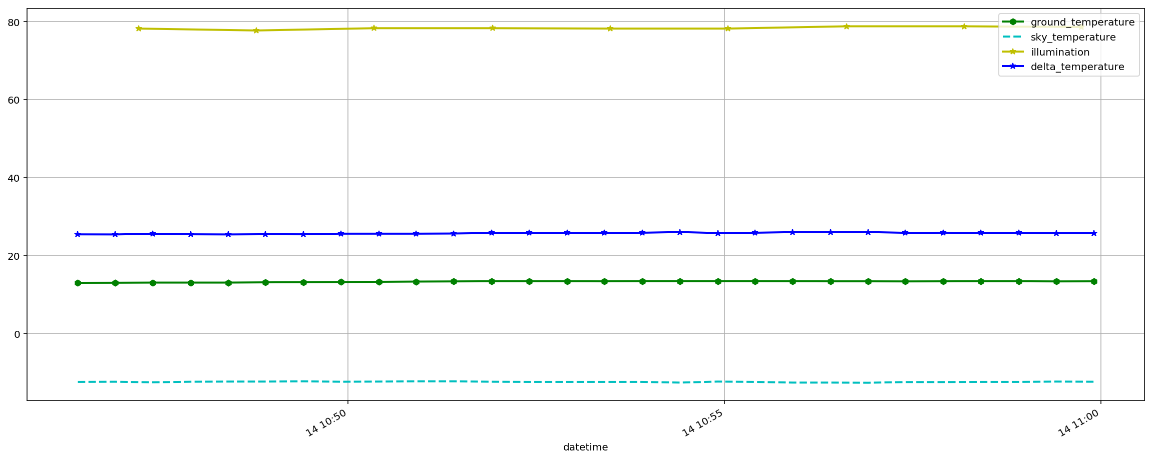
First thing to note is that the delta window with a query scheduled every 15 minutes means we will only have data for a 15 minute window, here’s what a typical plot of that data will look like;

And here’s the ‘data science’ bit – the rules we will use to determine whether it is night or day and whether it is cloudy or not. Obviously in this example we could basically do this in real-time from the incoming data stream, but imagine that you needed to do much more complex analysis … that’s where the real power of Jupyter notebooks and Amazon Sagemaker comes to the fore. For now though, we’ll just do something simple;

mean = statistics.mean(df_delta)
sigma = statistics.stdev(df_delta)

sky='Changeable'

if (sigma < 5 and mean > 20) :
    sky = 'Clear'
if (sigma < 1 and mean > 25) :
    sky = 'Very Clear'
if (sigma < 5 and mean <= 3) :
    sky = 'Rain or Snow'
if (sigma < 5 and mean > 3 and mean <= 10) :
    sky = 'Low cloud'
if (sigma < 5 and mean >12 and mean <= 15) :
    sky = 'High cloud'

mean,sigma,sky

So we’ll basically report Very Clear, Clear, Rain or Snow, Low cloud or High cloud depending on the difference between the temperature of the sky and ground which is a viable measure of cloud height.

We’ll also determine if it is night or day by looking at the light readings from another sensor in the same physical location.

Automation

We can test our new notebook by running it as normal, but when we’re ready to automate the workflow we need to containerize the notebook so it can be independently executed without any human intervention. Full details on this process are documented over at AWS

Trigger the notebook container after the data set

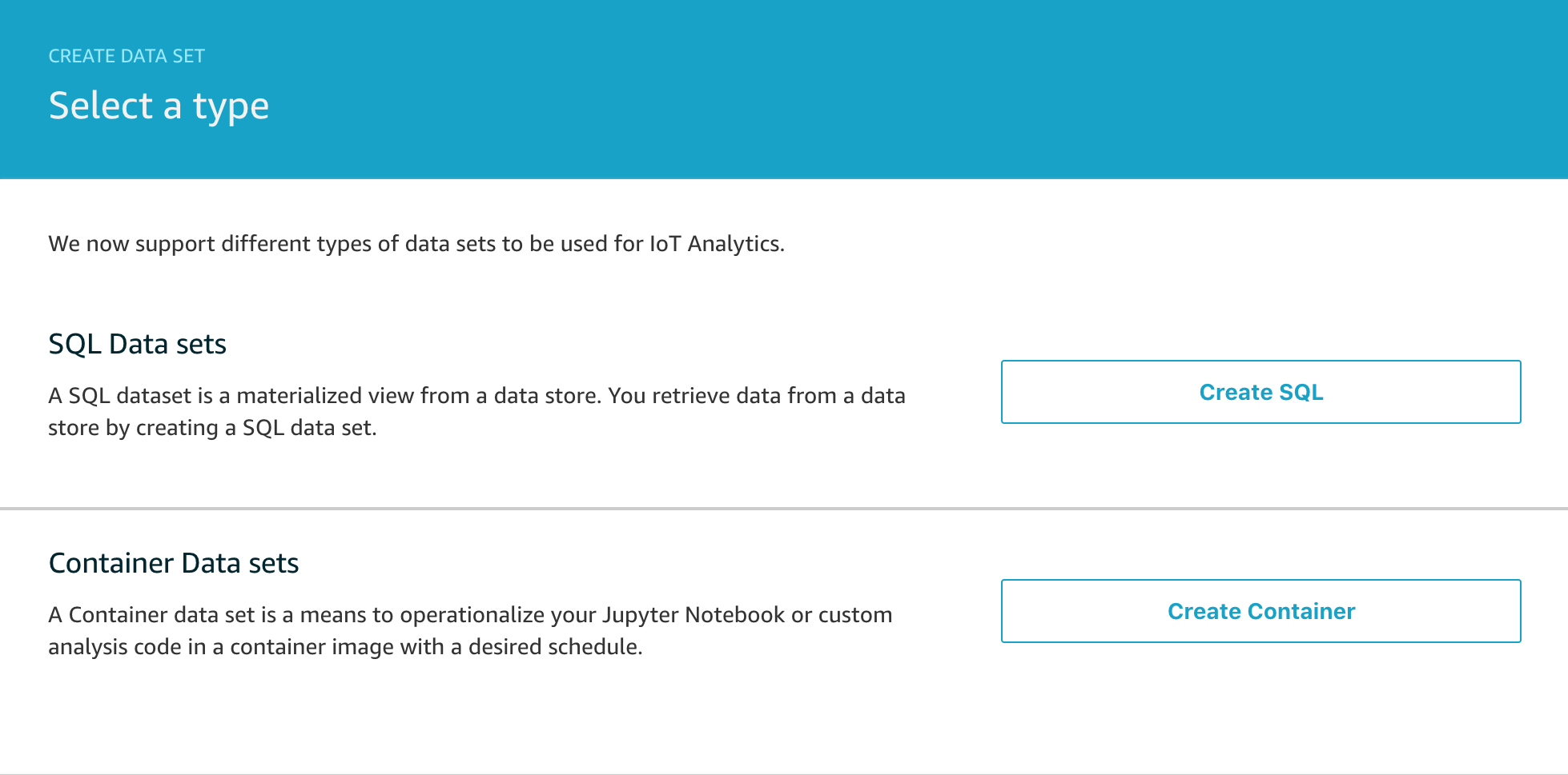
Once you’ve completed the containerization, the next step is to create a new data set that will execute it once the SQL data set has completed.

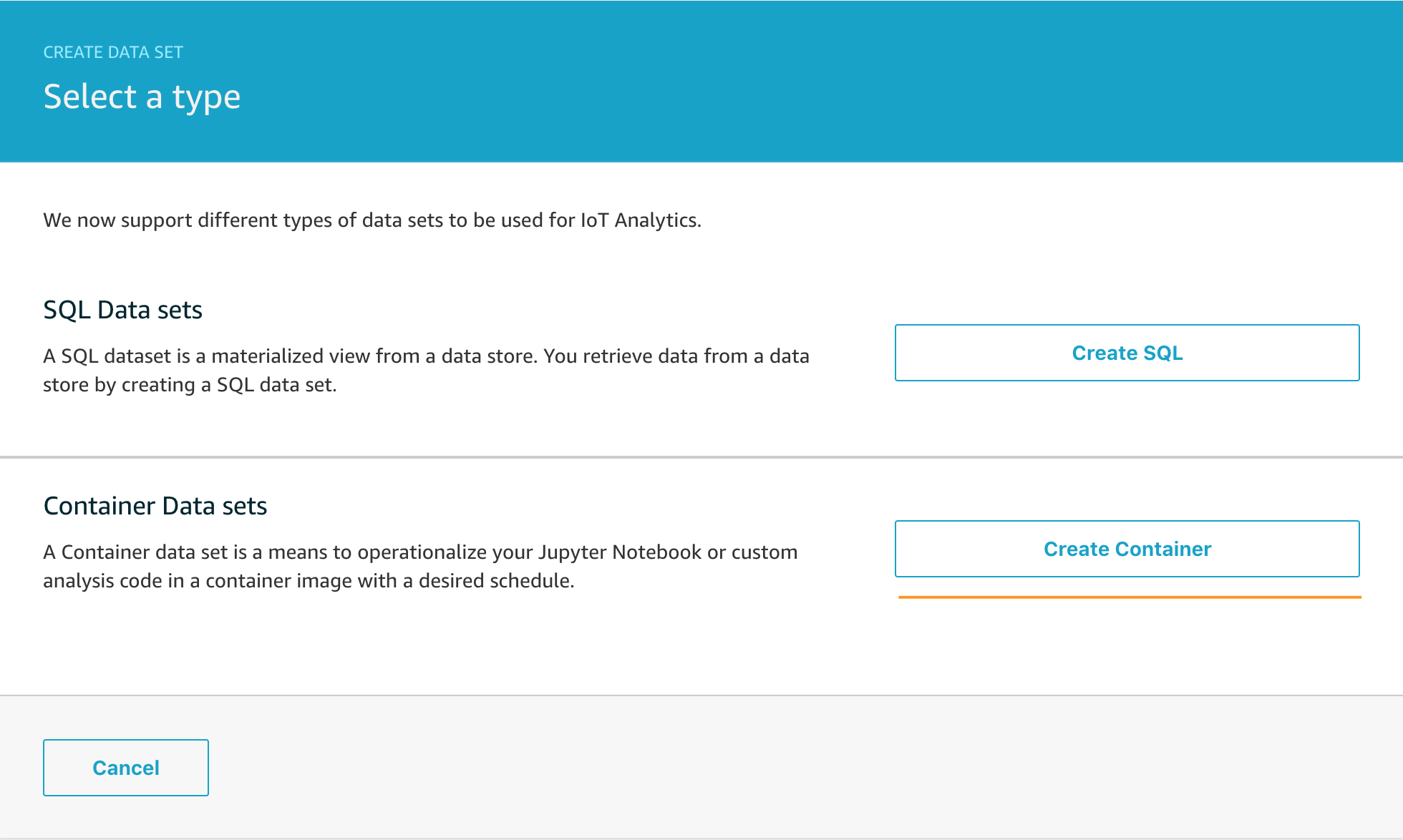
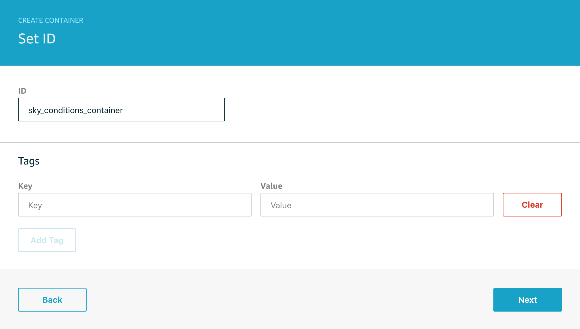
Select Create Container and on the next screen name your data set so you can easily find it in the list of data sets later.

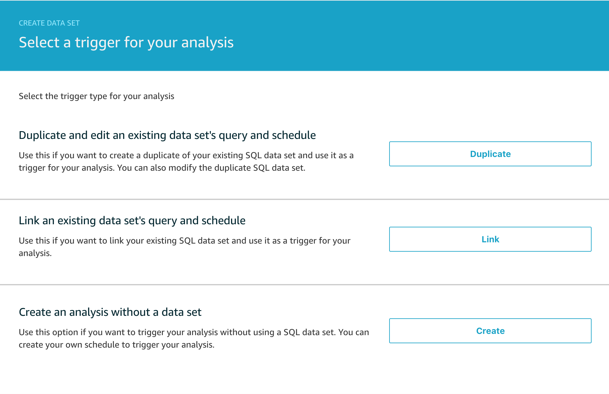
Now you want to select the trigger for the analysis. You don’t have to trigger the container execution from a data set, but it is quite a common workflow and the one we’re going to use today, so click Link to select the trigger from the 3 options below.

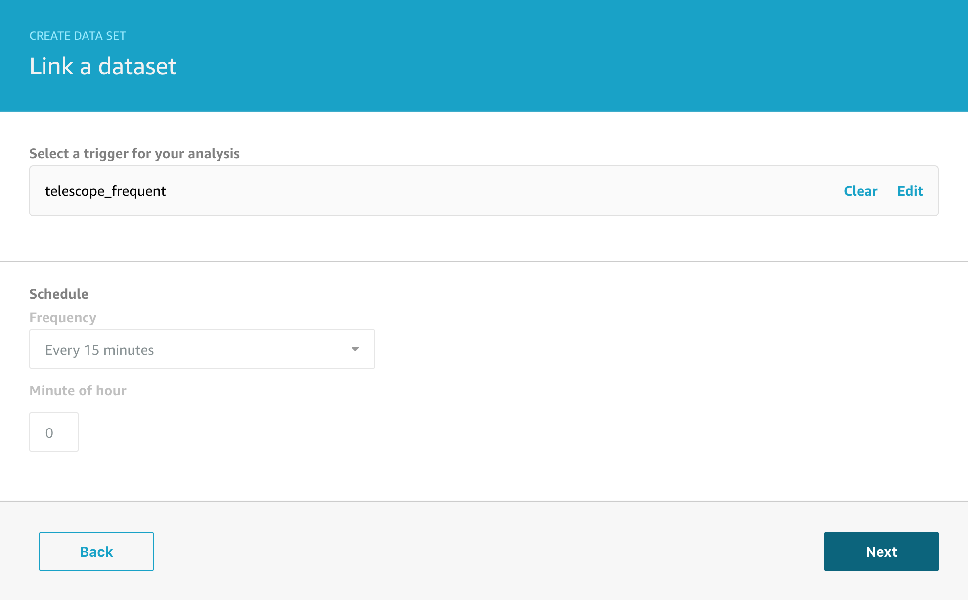
Next we have to select which data set we want to link this analysis to.

And then we need to configure the source container that will be executed.

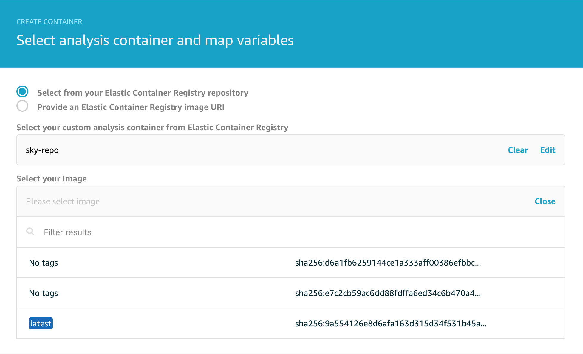
Note that you can choose to deploy any arbitrary container from Amazon ECR but we’re going to choose the container we created earlier. Note that the latest image is tagged to help you locate it since typically you will want to run the most recent version you have containerised.

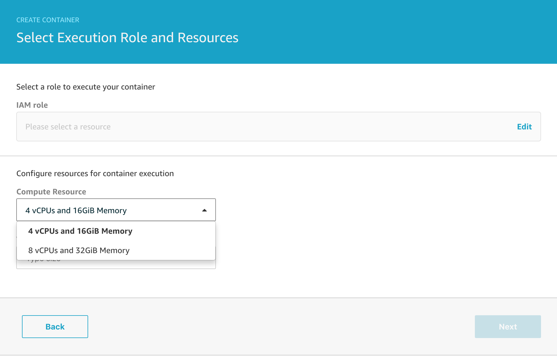
On the next page, note that you can select between different compute resources depending on the complexity of the analysis you need to run. I typically pick the 4 vCPU / 16GiB version just to be frugal.

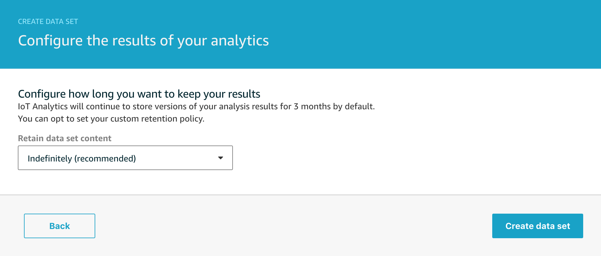
The final step is to configure the retention period for your data set and then we’re all set.

Although there are a lot of steps, once you’ve done this a couple of times it all becomes very straight-forward indeed. We now have the capability to execute a powerful piece of analysis triggered by the output of the SQL data set and do this entire workflow on a schedule of our choosing. The automation possibilities this opens up are significant and go beyond my simple example of sending me a message when the weather changes locally.


Vibration analysis with the ESP8266 & MPU6050

Our furnace blower motor began making an awful noise recently and despite best efforts to persuade it to run smoothly by adjusting the belt tension, there was an annoying rhythmical thump-thump-thump noise coming from it. Although detecting this degraded operation was super easy after the fact, I wondered how easy it would be do detect the early signs of a problem like this where essentially I would want to look for unusual vibration patterns to spot them well in advance of being able to hear that anything was wrong.

While looking at vibration sensors, I came across various small gyros and accelerometers and figured that they might be just the thing, so I ordered a few different types and prototyped a small project using the MPU6050 6 axis gyro / accelerometer package.

I used an ESP8266 micro-controller to gather the data and send it to an MQTT topic using AWS IoT Core and the 8×8 display segment is used to tell me when the device is capturing and when it is sending.

The accelerometer package is on the small board with the long plastic stick attached. I decided to use this so I could clip it into a photo hook that I could stick on the furnace motor. I know the physics of this are distinctly questionable, but I was interested if I could make any sense of the accelerometer readings.

Here it is all hooked up and capturing data – hence the large ‘C’ on the display.

The code for the ESP8266 was written using the Arduino IDE and makes use of the MIT licensed i2cdevlib for code to handle the MPU6050 accelerometer which is a remarkably competent sensor in a small package that can do a lot more than this simple project demonstrates.

Hopefully if you’ve been reading previous blogs, you’ll recall that we can use our standard pattern here of;

  1. Send data to AWS IoT Core MQTT topic
  2. Use a Rule to route the message to an AWS IoT Analytics Channel
  3. Connect the Channel to a Pipeline to a Data Store for collecting all the data
  4. Use data sets to perform the analysis

For sending the data to AWS IoT Core, I use the well established Arduino pubsubclient library and my publication method looks like this, with much of the code being for debugging purposes and helping me see what the device is doing.

int publish_mqtt(JsonObject &root,char const *topic) {

    int written = 0;
    if (root.success()) {    
       written = root.printTo(msg);
    }

    sprintf(outTopic,"sensor/%s/%s",macAddrNC,topic);
  
    Serial.print(F("INFO: "));    
    Serial.print(outTopic);
    Serial.print("->");
    Serial.print(msg);
    Serial.print("=");
    
    int published = (pubSubClient.publish(outTopic, msg))? 1:0;
    Serial.println(published);    
    return published;
}

The Rule simply routes all the sensor data to the appropriate topic like this;

But let’s take a look at the dataset – what information are we actually recording from this sensor?

Of course we can look at the C code running on the micro-controller to see what I send, and that looks like this;

void publish_data(int index) {
 
    if (!pubSubClient.connected()) { return; }
 
    DynamicJsonBuffer jsonBuffer(256);
    JsonObject &root = jsonBuffer.createObject();
   
    VectorInt16 datapoint = capture[index];
    root["seq"]=sequence;
    root["i"]= index;
    root["x"]=datapoint.x;
    root["y"]=datapoint.y;
    root["z"]=datapoint.z;
    publish_mqtt(root,"vibration/mpu6050");   
    jsonBuffer.clear();
           
}

And when we extract that data with a simple SQL query to get all of the data, we see a preview like this;

The x/y/z readings are the accelerometer readings for each of the x/y/z axes.  These aren’t quite raw sensor readings, they are the acceleration with the effect of gravity removed, and while this isn’t directly important for this example, the code that does that with the MPU6050 in my C code looks like this;

mpu.dmpGetQuaternion(&q, fifoBuffer);
mpu.dmpGetAccel(&aa, fifoBuffer);
mpu.dmpGetGravity(&gravity, &q);
mpu.dmpGetLinearAccel(&aaReal, &aa, &gravity);
VectorInt16 datapoint = VectorInt16(aaReal.x,aaReal.y,aaReal.z);

What about the sequence number and the i value?

My example code samples data for a few seconds from the sensor at 200Hz and then stops sampling and switches to sending mode, then it repeats this cycle. To help me make sense of it all, the sequence number is the epoch time for the start of each capture run and the i value is simply an index that counts from 0 up through n where n is the number of samples. This helps me analyse each chunk of data separately if I want to.

I was quite excited to see what this data looked like, so I created a Notebook in AWS IoT Analytics and did a simple graph of one of the samples. Hopefully the pattern of reading a dataset and plotting a graph is becoming familiar now so I won’t include all the setup code, but here’s the relevant extract from the Jupyter Notebook;

# Read the dataset

client = boto3.client('iotanalytics')
dataset = "vibration"
dataset_url = client.get_dataset_content(datasetName = dataset)['entries'][0]['dataURI']
df = pd.read_csv(dataset_url)

# Extract 1000 sample points from the sequence that began at 1518074892

analysis = df[((df['seq'] == 1518074892) & (df['i'] < 1000))].sort_values(by='i', ascending=True, inplace=False)

# Graph the accelerometer X axis readings

analysis.plot(title='Vibration Analysis x', \
                         kind='line',x='i',y='x',figsize=(20,8), \
                         color='red',linewidth=1,grid=True)

I was really pretty excited when I saw this first result. The data is clearly cyclical and it looks like the sample rate of 200Hz might have been fast enough to get something usable.

Let’s check this isn’t a fluke and look at the y-axis data as well. It’s worth saying that because I just randomly stuck the sensor onto the motor, my vibration data will be spread across the x,y,z axes and I was interested to see if this rendered the data unusable or whether something as simple as this could work.

This looks slightly cleaner than the x-axis data, so I chose to use that for the next steps.

Now for some basic data science

I have the raw data and what I want to know is – what are the key vibration energies of this motor. This helps answer the question is it running smoothly or is there a problem? How do I turn the waveform above into an energy plot of the main vibration frequencies? This is a job for a fast Fourier transform which “is an algorithm that samples a signal over a period of time and divides it into its frequency components”. Just what I need.

Well almost – perfect. So I now know I want to use a FFT to analyse the data, but how do I do that? This is where the standard data science libraries available with Amazon Sagemaker Jupyter Notebooks come to the rescue and I can use scipy and fftpack with a quick import like this;

import scipy.fftpack

This lets me do the FFT analysis with just a few lines of code;

sig = analysis['y']
sig_fft = scipy.fftpack.fft(sig)

# Why 0.005? The data is being sampled at 200Hz
time_step = 0.005

# And the power (sig_fft is of complex dtype)
power = np.abs(sig_fft)

# The corresponding frequencies
sample_freq = scipy.fftpack.fftfreq(sig.size, d=time_step)

# Only interested in the positive frequencies, the negative just mirror these. 
# Also drop the first data point for 0Hz

sample_freq = sample_freq[1:int(len(sample_freq)/2)]
power = power[1:int(len(power)/2)]

For the moment of truth, let’s plot this on a graph and see if we have a clear signal we can interpret from the data.

plt.figure(figsize=(20, 8))
plt.xlabel('Frequency [Hz]')
plt.ylabel('Power')
plt.title("FFT Spectrum for single axis")
plt.xticks(np.arange(0, max(sample_freq)+1, 2.0))
plt.plot(sample_freq, power, color='blue')

I was pretty excited when I saw this as the plot of power against frequency made sense. The large spike at around 11Hz aligned with the thump-thump-thump noise I could hear and the smaller, but still significant spike at 30Hz could well be the ‘normal’ operating vibration since the mains frequency is 60Hz. I’m guessing a bit at this since I’m neither a data scientist, a motor expert or an electrician, but it made sense to me. The important thing is that we have extracted a clear signal from the data that can be used to provide an insight.

Detecting clouds and clear skies (part two)

Last time we covered how to route data from a cloud sensor to IoT Analytics and how to create a SQL data set that would be executed every 15 minutes containing the most recent data. Now that we have that data, what sort of analysis can we do on it to find out if the sky is cloudy or clear?

AWS IoT Analytics is integrated with a powerful data science tool, Amazon Sagemaker, which has easy to use data exploration and visualization capabilities that you can run from your browser using Jupyter Notebooks. Sounds scary, but actually it’s really straight forward and there are plenty of web based resources to help you learn and explore increasingly advanced capabilities.

Let’s begin by drawing a simple graph of our cloud sensor data as often visualizing the data is the first step towards deciding how to do some analysis. From the IoT Analytics console, tap Aalyze and then Notebooks from the left menu. Tap Create Notebook to reach the screen below.

There are a number of pre-built templates you can explore, but for our project, we’re going to start from a Blank Notebook so tap on that.

To create your Jupyter notebook (and the instance on which it will run), follow the official documentation Explore your Data section and get yourself to the stage where you have a blank notebook in your browser.

Let’s start writing some code. We’ll be using Python for writing our analysis in this example.

Enter the following code in the first empty cell of the notebook. This code loads the boto3 AWS SDK , the pandas library which is great for slicing and dicing your data, and mathplotlib which we will use for drawing our graph. The final statement allows the graph output to appear inline in the notebook when executed.

import boto3
import pandas as pd
from matplotlib import pyplot as plt
%matplotlib inline

Your notebook should start looking like the image below – we’ll explain the rest of the code shortly.

client = boto3.client('iotanalytics')
dataset = "cloudy"
dataset_url = client.get_dataset_content(datasetName = dataset)['entries'][0]['dataURI']
df = pd.read_csv(dataset_url)

This code reads the dataset produced by our SQL query into a panda data frame. One way of thinking about a data frame is that it’s like an Excel spreadsheet of your data with rows and columns and this is a great fit for our data set from IoT Analytics which is already in tabular format as a CSV – so we can use the read_csv function as above.

Finally, to draw a graph of the data, we can write this code in another cell.

df['datetime'] = pd.to_datetime(df["received"]/1000, unit='s')
ax1 = df.plot(kind='line',x='datetime',y='object',color='blue',linewidth=4)

df.plot(title='Is it cloudy?',ax=ax1, \
                         kind='line',x='datetime',y='ambient',figsize=(20,8), \
                         color='cyan',linewidth=4,grid=True)

When you run this cell, you will see the output like this for example

Here’s all the code in one place to give a sense of how little code you need to write to achieve this.

import boto3
import pandas as pd
from matplotlib import pyplot as plt
%matplotlib inline

client = boto3.client('iotanalytics')
dataset = "cloudy"
dataset_url = client.get_dataset_content(datasetName = dataset)['entries'][0]['dataURI']
df = pd.read_csv(dataset_url)
df['datetime'] = pd.to_datetime(df["received"]/1000, unit='s')

ax1 = df.plot(kind='line',x='datetime',y='object',color='blue',linewidth=4)
df.plot(title='Is it cloudy?',ax=ax1, \
                         kind='line',x='datetime',y='ambient',figsize=(20,8), \
                         color='cyan',linewidth=4,grid=True)

Of course what would be really nice would be to be able to run analysis like this automatically every 15 minutes and notify us when conditions change, this will be the topic of a future post that harnesses a recently released feature of IoT Analytics  for automating your workflow and in the meantime you can read more about that in the official documentation.


Detecting clouds and clear skies (part one)

As a keen, yet lazy, amateur astronomer, my quest for a fully automated observatory continues. My ideal morning would start with a lovely cup of coffee and an email from my observatory telling me what it was able to image overnight along with some nice photos. To achieve this, one of the pieces of information I need the computer system to know is whether the sky is clear or not. If it’s clear, then we can open the observatory roof, if it’s cloudy, we should stop the observation session – that sort of thing.

Unsurprisingly, finding sensors to detect clouds isn’t that straight forward, but it turns out that a possible solution comes from a neat little infra-red temperature sensor. Point one of these straight up to the sky, and you’ll get quite different readings when it’s cloudy or clear, so a bit of data analysis can easily determine if it’s likely to be worth rolling back the observatory roof or not.

For my project, I used some gorilla glue to fix the sensor inside a cable gland and then mounted it on the top of a small project box like this.

Inside the box, all we need is a trusty ESP8266 Micro-controller, a power connector and a few resistors – total project cost around $30. Commercial cloud sensors (yes, you can buy such a thing) start at several hundred $ and up, so if we can get this to work, it will be a very frugal option.

As you can see, I’ve left the USB cable connected to the device so that I can easily re-program the MCU later if required. I could of course do this with an OTA (over the air) update, but for this project the cable is fine.

Here it is, screwed onto the fence in the garden.

So what does the data look like? The upper cyan line is the ‘ambient’ or local temperature at sensor level whereas the dark blue like is the ‘object’ or remote temperature. The larger the difference, the clearer the skies, and when they are reading the same, that typically means there is rain or snow directly on the sensor window.

The software running on the MCU is written in C using the Arduino IDE and the ESP8266 SDK. It doesn’t do anything complex, it connects to the local WiFi network, establishes a secure MQTT connection with AWS IoT Core, and then every 30 seconds or so it reads the temperature sensor and then publishes the data to an MQTT topic. It really is a ‘dumb’ data collector since it makes no attempt to infer the state of the sky locally on the box.

So how do we pick up the MQTT data and analyze it? I’d like to be able to infer the state of the sky now, but also to have a historic record of my data for later analysis, and perhaps to use for training a machine learning model against other sources of data (images of the sky for example). For scenarios where you want to store the connected device data, AWS IoT Analytics is often a good fit and so what I’m going to do is as follows;

  1. Create a Data Store in AWS IoT Analytics to collect all my data
  2. Create a Channel to receive the data from the MQTT Topic
  3. Create a Pipeline to join the Channel to the Data Store, and perhaps send some real-time data to CloudWatch at the same time.
  4. Create a Rule in AWS IoT Core to route data from the MQTT topic to my channel
  5. Schedule a dataset to analyze the data every 15 minutes
  6. Publish to an SNS topic when it’s both dark and the sky seems clear

I covered steps 1 to 4 in an earlier introductory blog with part one and part two, and the principle is the same for any project like this. Let’s turn our attention to the analysis part of the project.

Head back to the IoT Analytics console and from the Analyze sub-menu, select Data sets and then tap Create

SQL Data sets are used when you want to execute a query against your data store and this is the common use case and what we will want to start with. Container Data sets are more advanced and let you trigger the execution of arbitrary Python (or indeed a custom container) once the SQL Data set is ready. Container Data sets are both powerful and flexible as we will see a bit later on.

So let’s start by creating the SQL Data set, tap on Create SQL and pick a suitable name and select the Data Store that you want to execute the query against.

Tap Next and now we get the SQL editing screen where we can enter our query that will run every 15 minutes.

The query I’m using in more detail is;

SELECT ambient,object,status.uptime,status.rssi,status.heap,epoch,received FROM cloudy_skies 
WHERE __dt >= current_date - interval '5' day 
AND full_topic like '%infrared/temperature'

An important note here is the __dt WHERE clause. IoT Analytics stores your messages partitioned by ingest date to make query performance faster and lower your costs. Without this line, the whole data store would be scanned and depending on how much data you have, this could take a very long time to complete. In this case, I’m choosing to pull out the most recent 5 days of data, which is more than I actually need to know if it is currently cloudy or not, but gives me flexibility in the next stage when I author a Jupyter Notebook to do the analysis.

Once you have your query, tap Next to configure the data selection window.

I’m going to use the default ‘None’ option here. The other option, delta windows, is a powerful option that enables you to perform analysis on only the new data that has arrived since you last queried the data. I’ll cover this more advanced topic in a future post, but for now just tap on Next to move on to the scheduling page.

Setting a schedule is entirely optional, but in this case we want to check on sky conditions every 15 minutes, so we can choose that option from the drop-down menu and tap Next to move to the final step, setting the retention policy.

Retention policies are useful when you might have large data sets that are incurring storage costs you’d prefer to avoid and you don’t need the data to be available for long periods. For this project, my data sets are small and I don’t need to take any special action, so just tap on the final Create data set button and we’re done.

Let’s review what we’ve done

We’ve created a Channel connected to a Pipeline feeding a Data store where all the IoT device data will be collected.

We’ve created a rule in IoT Core to route data from the appropriate MQTT topic into the Channel.

We’ve created a Data set that will execute a SQL query every 15 minutes to gather the most recent data.

How do we do some analysis on this data to see if the sky is clear though? I’ll cover that in part two.