
Last time we covered how to route data from a cloud sensor to IoT Analytics and how to create a SQL data set that would be executed every 15 minutes containing the most recent data. Now that we have that data, what sort of analysis can we do on it to find out if the sky is cloudy or clear?
AWS IoT Analytics is integrated with a powerful data science tool, Amazon Sagemaker, which has easy to use data exploration and visualization capabilities that you can run from your browser using Jupyter Notebooks. Sounds scary, but actually it’s really straight forward and there are plenty of web based resources to help you learn and explore increasingly advanced capabilities.
Let’s begin by drawing a simple graph of our cloud sensor data as often visualizing the data is the first step towards deciding how to do some analysis. From the IoT Analytics console, tap Aalyze and then Notebooks from the left menu. Tap Create Notebook to reach the screen below.
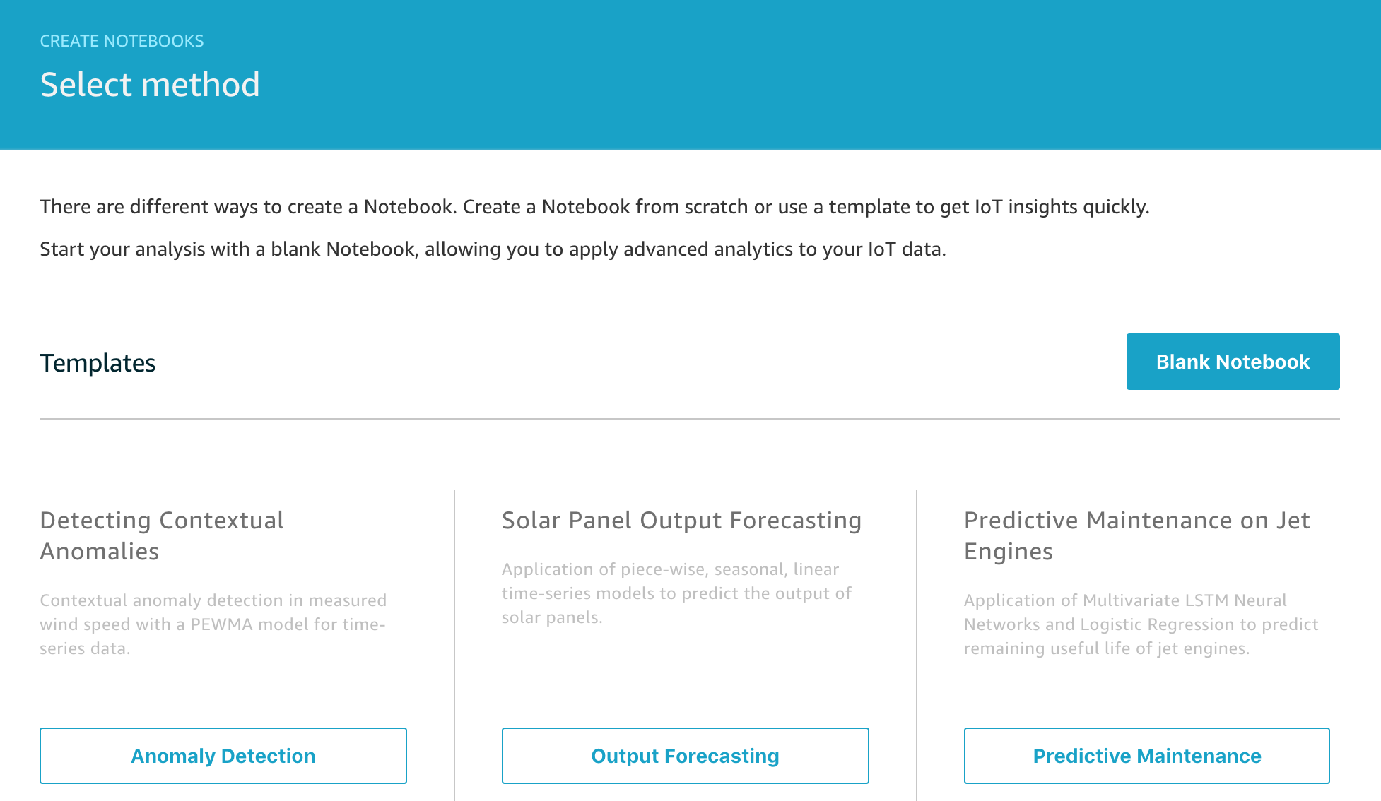
There are a number of pre-built templates you can explore, but for our project, we’re going to start from a Blank Notebook so tap on that.
To create your Jupyter notebook (and the instance on which it will run), follow the official documentation Explore your Data section and get yourself to the stage where you have a blank notebook in your browser.
Let’s start writing some code. We’ll be using Python for writing our analysis in this example.
Enter the following code in the first empty cell of the notebook. This code loads the boto3 AWS SDK , the pandas library which is great for slicing and dicing your data, and mathplotlib which we will use for drawing our graph. The final statement allows the graph output to appear inline in the notebook when executed.
import boto3
import pandas as pd
from matplotlib import pyplot as plt
%matplotlib inline
Your notebook should start looking like the image below – we’ll explain the rest of the code shortly.
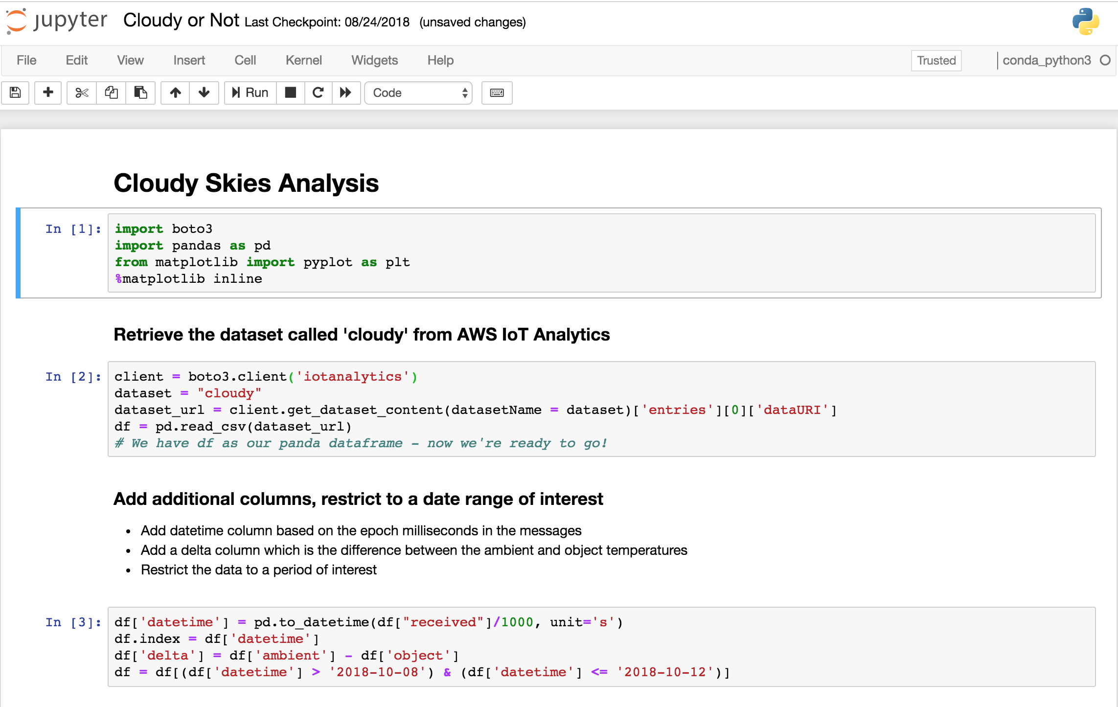
client = boto3.client('iotanalytics')
dataset = "cloudy"
dataset_url = client.get_dataset_content(datasetName = dataset)['entries'][0]['dataURI']
df = pd.read_csv(dataset_url)
This code reads the dataset produced by our SQL query into a panda data frame. One way of thinking about a data frame is that it’s like an Excel spreadsheet of your data with rows and columns and this is a great fit for our data set from IoT Analytics which is already in tabular format as a CSV – so we can use the read_csv function as above.
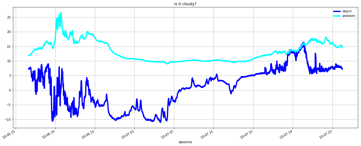
Finally, to draw a graph of the data, we can write this code in another cell.
df['datetime'] = pd.to_datetime(df["received"]/1000, unit='s')
ax1 = df.plot(kind='line',x='datetime',y='object',color='blue',linewidth=4)

df.plot(title='Is it cloudy?',ax=ax1, \
                         kind='line',x='datetime',y='ambient',figsize=(20,8), \
                         color='cyan',linewidth=4,grid=True)
When you run this cell, you will see the output like this for example
Here’s all the code in one place to give a sense of how little code you need to write to achieve this.
import boto3
import pandas as pd
from matplotlib import pyplot as plt
%matplotlib inline

client = boto3.client('iotanalytics')
dataset = "cloudy"
dataset_url = client.get_dataset_content(datasetName = dataset)['entries'][0]['dataURI']
df = pd.read_csv(dataset_url)
df['datetime'] = pd.to_datetime(df["received"]/1000, unit='s')

ax1 = df.plot(kind='line',x='datetime',y='object',color='blue',linewidth=4)
df.plot(title='Is it cloudy?',ax=ax1, \
                         kind='line',x='datetime',y='ambient',figsize=(20,8), \
                         color='cyan',linewidth=4,grid=True)
Of course what would be really nice would be to be able to run analysis like this automatically every 15 minutes and notify us when conditions change, this will be the topic of a future post that harnesses a recently released feature of IoT Analytics for automating your workflow and in the meantime you can read more about that in the official documentation.