Our furnace blower motor began making an awful noise recently and despite best efforts to persuade it to run smoothly by adjusting the belt tension, there was an annoying rhythmical thump-thump-thump noise coming from it. Although detecting this degraded operation was super easy after the fact, I wondered how easy it would be do detect the early signs of a problem like this where essentially I would want to look for unusual vibration patterns to spot them well in advance of being able to hear that anything was wrong.
While looking at vibration sensors, I came across various small gyros and accelerometers and figured that they might be just the thing, so I ordered a few different types and prototyped a small project using the MPU6050 6 axis gyro / accelerometer package.
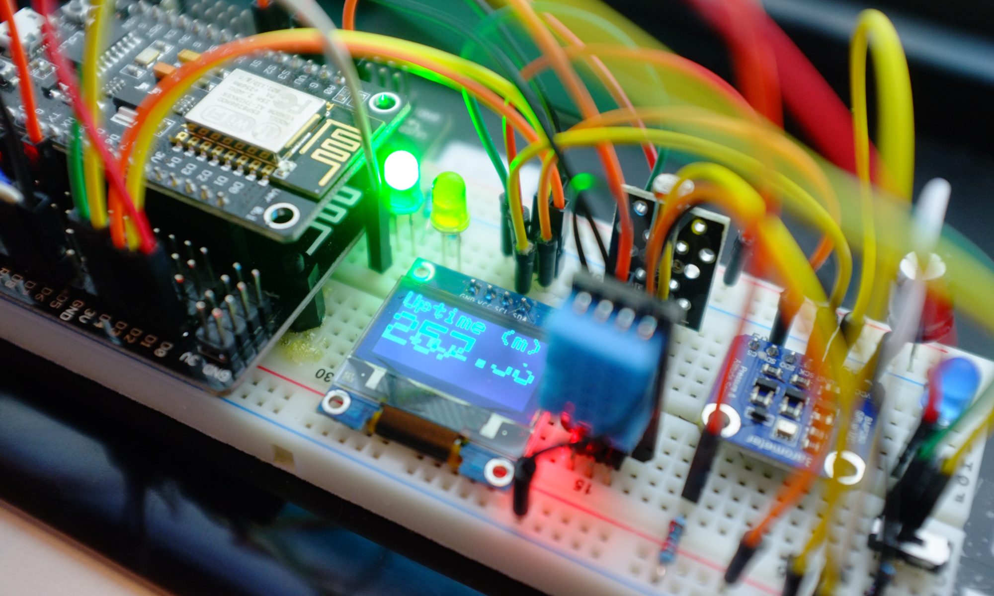
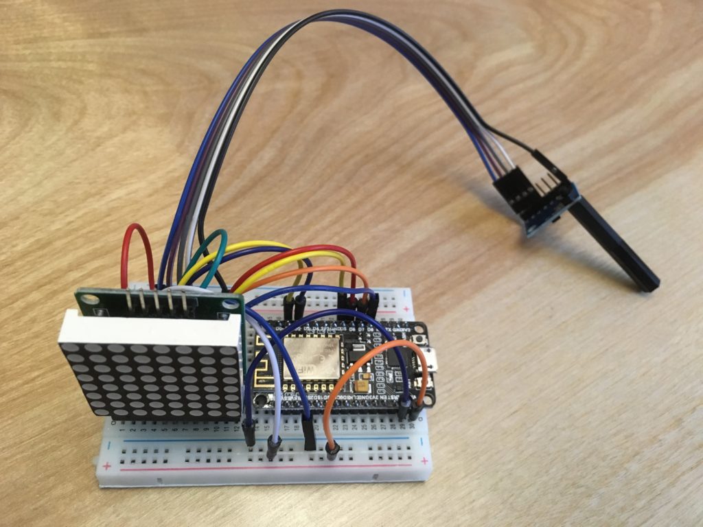
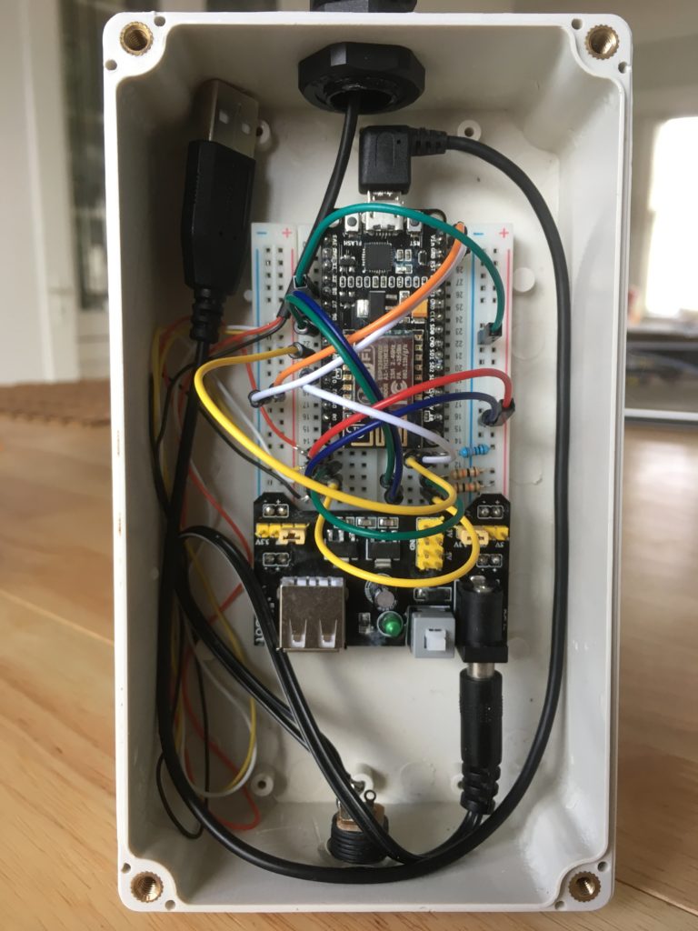
I used an ESP8266 micro-controller to gather the data and send it to an MQTT topic using AWS IoT Core and the 8×8 display segment is used to tell me when the device is capturing and when it is sending.

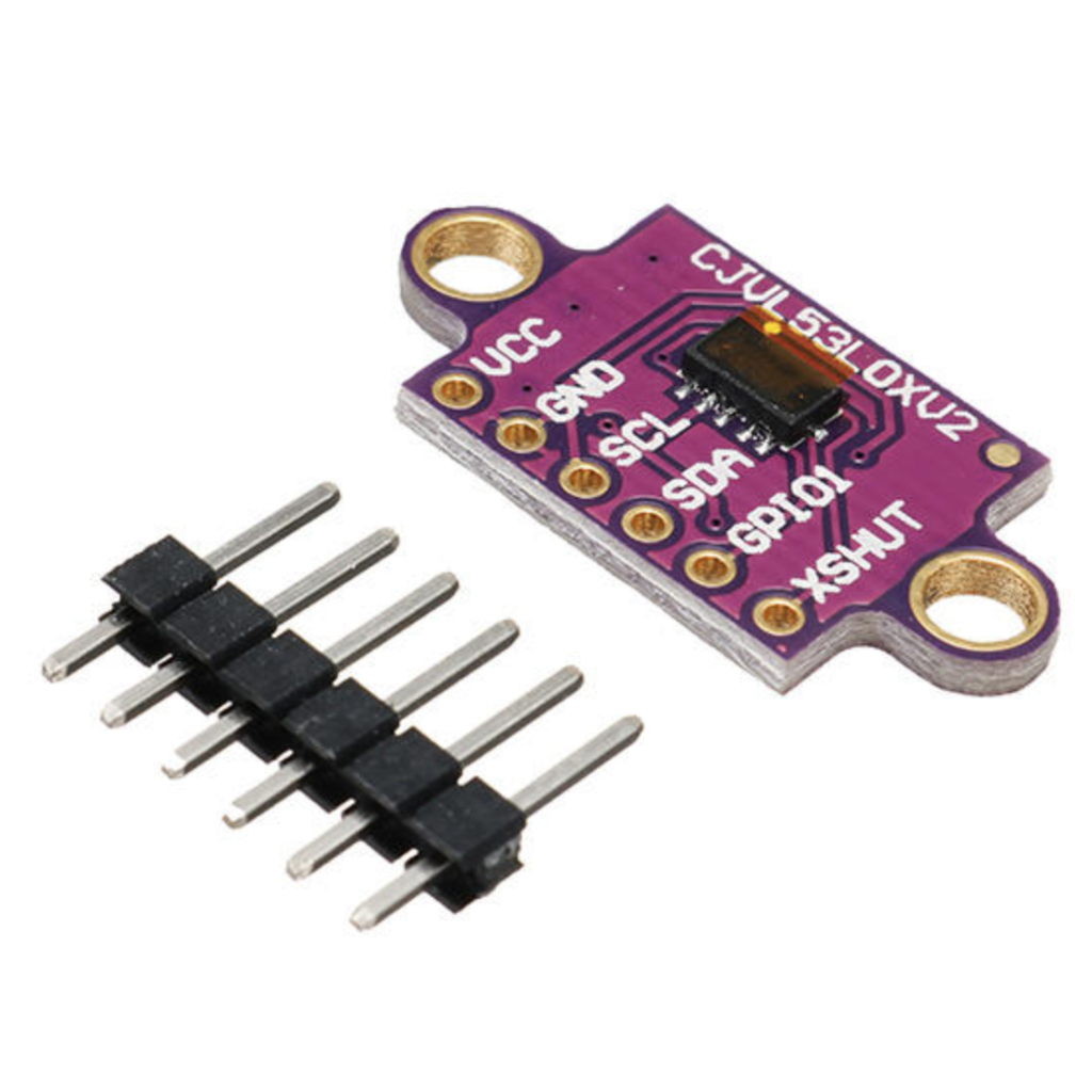
The accelerometer package is on the small board with the long plastic stick attached. I decided to use this so I could clip it into a photo hook that I could stick on the furnace motor. I know the physics of this are distinctly questionable, but I was interested if I could make any sense of the accelerometer readings.
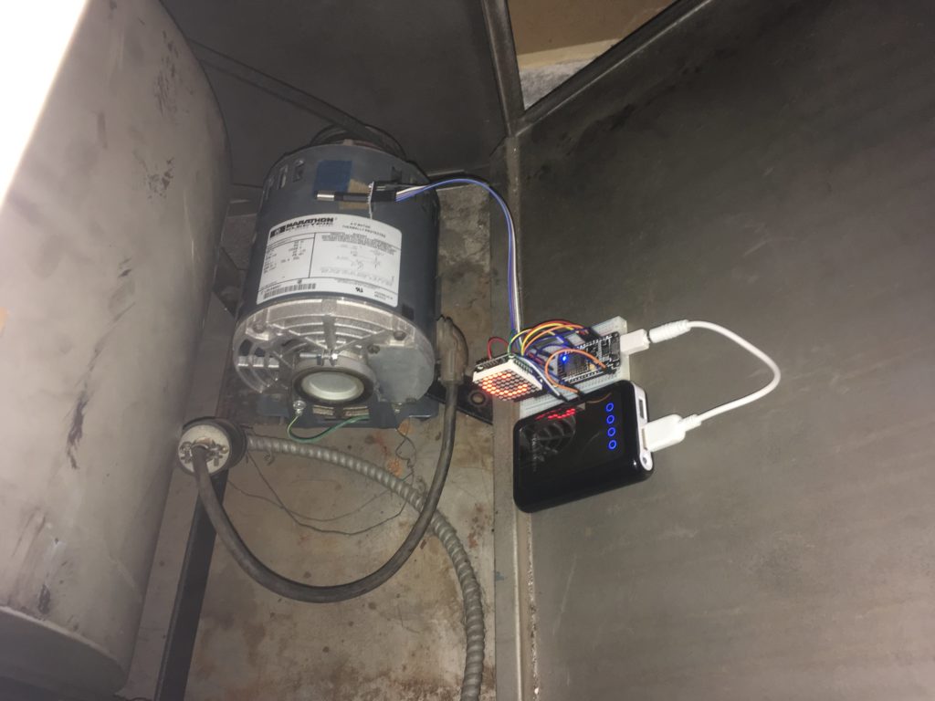
Here it is all hooked up and capturing data – hence the large ‘C’ on the display.

The code for the ESP8266 was written using the Arduino IDE and makes use of the MIT licensed i2cdevlib for code to handle the MPU6050 accelerometer which is a remarkably competent sensor in a small package that can do a lot more than this simple project demonstrates.
Hopefully if you’ve been reading previous blogs, you’ll recall that we can use our standard pattern here of;
- Send data to AWS IoT Core MQTT topic
- Use a Rule to route the message to an AWS IoT Analytics Channel
- Connect the Channel to a Pipeline to a Data Store for collecting all the data
- Use data sets to perform the analysis
For sending the data to AWS IoT Core, I use the well established Arduino pubsubclient library and my publication method looks like this, with much of the code being for debugging purposes and helping me see what the device is doing.
int publish_mqtt(JsonObject &root,char const *topic) {

    int written = 0;
    if (root.success()) {
       written = root.printTo(msg);
    }

    sprintf(outTopic,"sensor/%s/%s",macAddrNC,topic);

    Serial.print(F("INFO: "));
    Serial.print(outTopic);
    Serial.print("->");
    Serial.print(msg);
    Serial.print("=");

    int published = (pubSubClient.publish(outTopic, msg))? 1:0;
    Serial.println(published);
    return published;
}
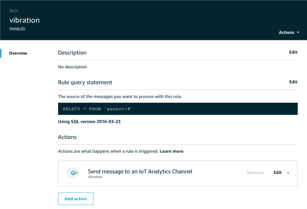
The Rule simply routes all the sensor data to the appropriate topic like this;

But let’s take a look at the dataset – what information are we actually recording from this sensor?
Of course we can look at the C code running on the micro-controller to see what I send, and that looks like this;
void publish_data(int index) {

    if (!pubSubClient.connected()) { return; }

    DynamicJsonBuffer jsonBuffer(256);
    JsonObject &root = jsonBuffer.createObject();

    VectorInt16 datapoint = capture[index];
    root["seq"]=sequence;
    root["i"]= index;
    root["x"]=datapoint.x;
    root["y"]=datapoint.y;
    root["z"]=datapoint.z;
    publish_mqtt(root,"vibration/mpu6050");
    jsonBuffer.clear();

}
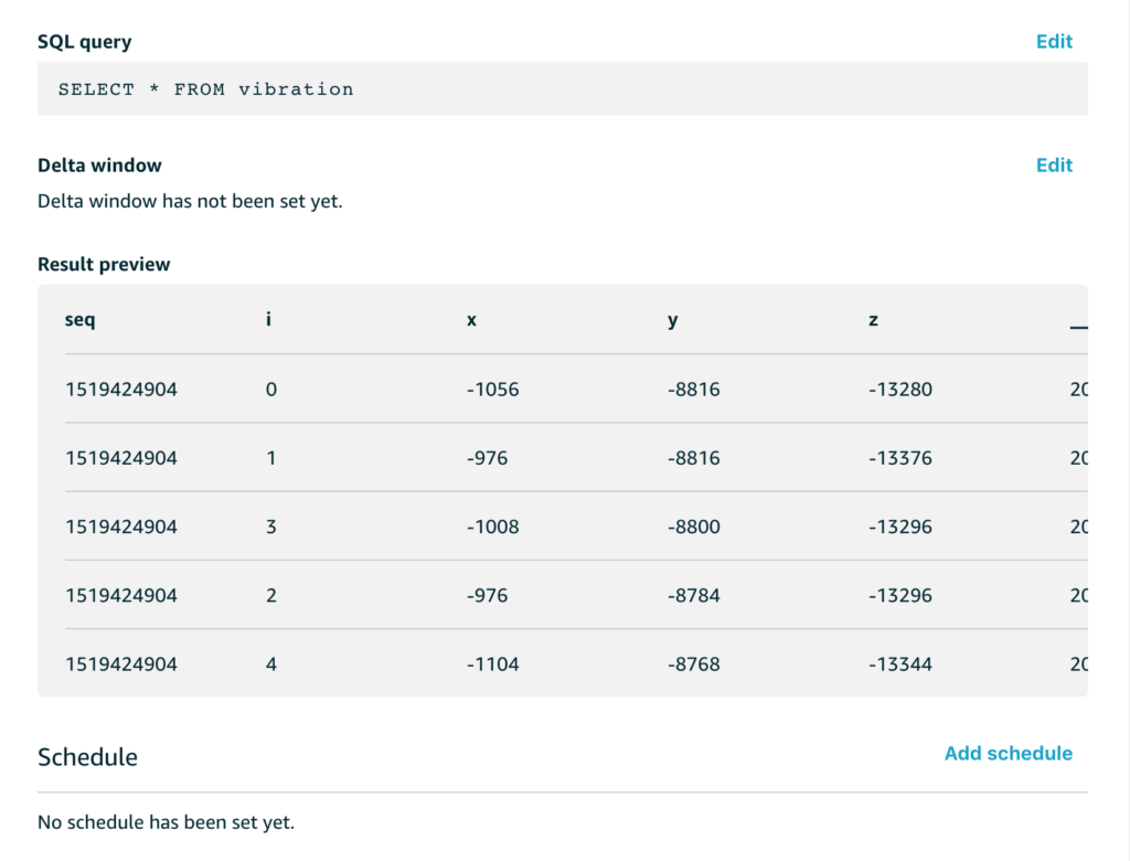
And when we extract that data with a simple SQL query to get all of the data, we see a preview like this;

The x/y/z readings are the accelerometer readings for each of the x/y/z axes. These aren’t quite raw sensor readings, they are the acceleration with the effect of gravity removed, and while this isn’t directly important for this example, the code that does that with the MPU6050 in my C code looks like this;
mpu.dmpGetQuaternion(&q, fifoBuffer);
mpu.dmpGetAccel(&aa, fifoBuffer);
mpu.dmpGetGravity(&gravity, &q);
mpu.dmpGetLinearAccel(&aaReal, &aa, &gravity);
VectorInt16 datapoint = VectorInt16(aaReal.x,aaReal.y,aaReal.z);
What about the sequence number and the i value?
My example code samples data for a few seconds from the sensor at 200Hz and then stops sampling and switches to sending mode, then it repeats this cycle. To help me make sense of it all, the sequence number is the epoch time for the start of each capture run and the i value is simply an index that counts from 0 up through n where n is the number of samples. This helps me analyse each chunk of data separately if I want to.
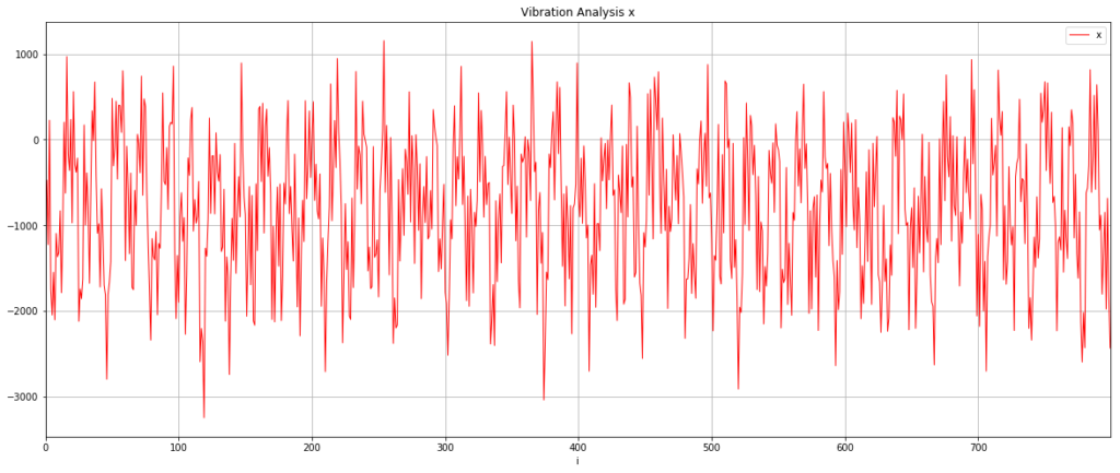
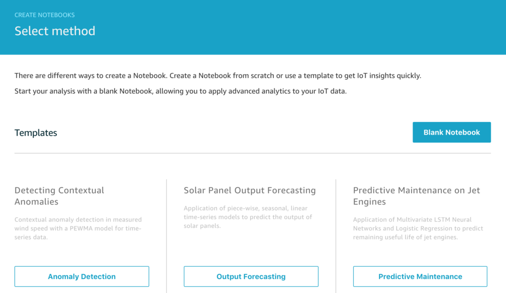
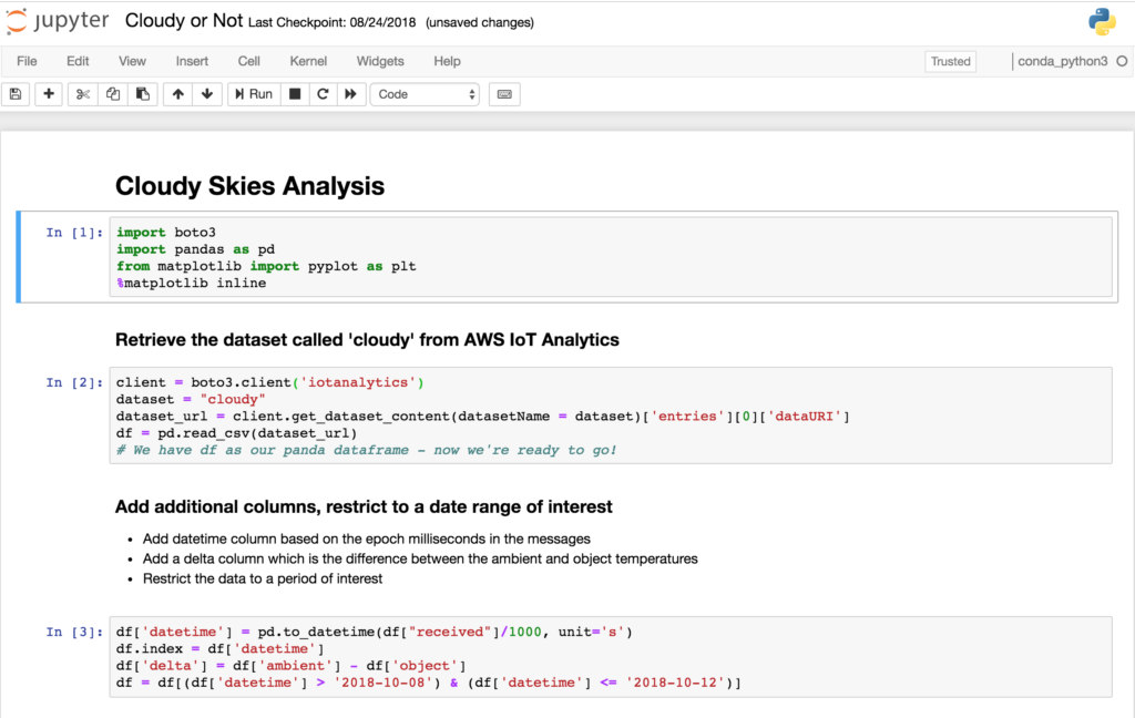
I was quite excited to see what this data looked like, so I created a Notebook in AWS IoT Analytics and did a simple graph of one of the samples. Hopefully the pattern of reading a dataset and plotting a graph is becoming familiar now so I won’t include all the setup code, but here’s the relevant extract from the Jupyter Notebook;
# Read the dataset

client = boto3.client('iotanalytics')
dataset = "vibration"
dataset_url = client.get_dataset_content(datasetName = dataset)['entries'][0]['dataURI']
df = pd.read_csv(dataset_url)

# Extract 1000 sample points from the sequence that began at 1518074892

analysis = df[((df['seq'] == 1518074892) & (df['i'] < 1000))].sort_values(by='i', ascending=True, inplace=False)

# Graph the accelerometer X axis readings

analysis.plot(title='Vibration Analysis x', \
                         kind='line',x='i',y='x',figsize=(20,8), \
                         color='red',linewidth=1,grid=True)
I was really pretty excited when I saw this first result. The data is clearly cyclical and it looks like the sample rate of 200Hz might have been fast enough to get something usable.

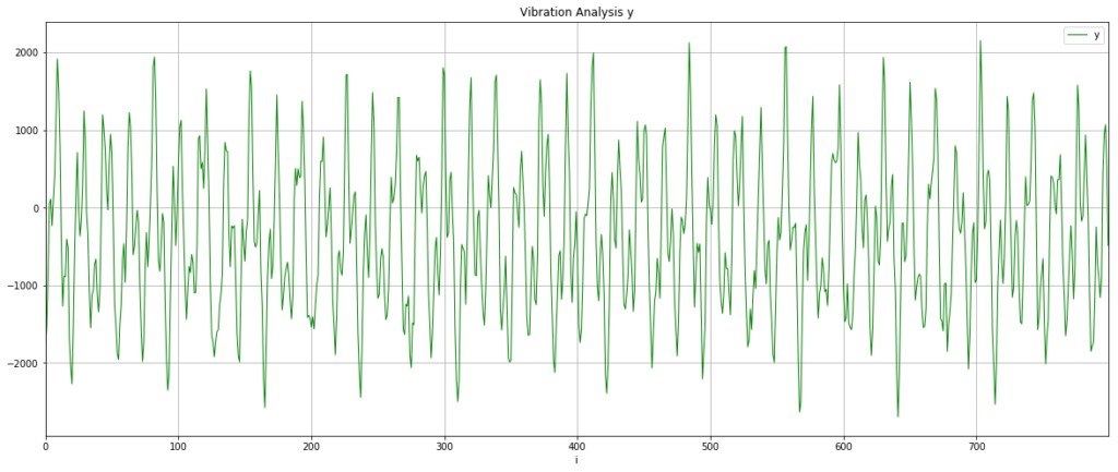
Let’s check this isn’t a fluke and look at the y-axis data as well. It’s worth saying that because I just randomly stuck the sensor onto the motor, my vibration data will be spread across the x,y,z axes and I was interested to see if this rendered the data unusable or whether something as simple as this could work.

This looks slightly cleaner than the x-axis data, so I chose to use that for the next steps.
Now for some basic data science
I have the raw data and what I want to know is – what are the key vibration energies of this motor. This helps answer the question is it running smoothly or is there a problem? How do I turn the waveform above into an energy plot of the main vibration frequencies? This is a job for a fast Fourier transform which “is an algorithm that samples a signal over a period of time and divides it into its frequency components”. Just what I need.
Well almost – perfect. So I now know I want to use a FFT to analyse the data, but how do I do that? This is where the standard data science libraries available with Amazon Sagemaker Jupyter Notebooks come to the rescue and I can use scipy and fftpack with a quick import like this;
import scipy.fftpack
This lets me do the FFT analysis with just a few lines of code;
sig = analysis['y']
sig_fft = scipy.fftpack.fft(sig)

# Why 0.005? The data is being sampled at 200Hz
time_step = 0.005

# And the power (sig_fft is of complex dtype)
power = np.abs(sig_fft)

# The corresponding frequencies
sample_freq = scipy.fftpack.fftfreq(sig.size, d=time_step)

# Only interested in the positive frequencies, the negative just mirror these.
# Also drop the first data point for 0Hz

sample_freq = sample_freq[1:int(len(sample_freq)/2)]
power = power[1:int(len(power)/2)]
For the moment of truth, let’s plot this on a graph and see if we have a clear signal we can interpret from the data.
plt.figure(figsize=(20, 8))
plt.xlabel('Frequency [Hz]')
plt.ylabel('Power')
plt.title("FFT Spectrum for single axis")
plt.xticks(np.arange(0, max(sample_freq)+1, 2.0))
plt.plot(sample_freq, power, color='blue')

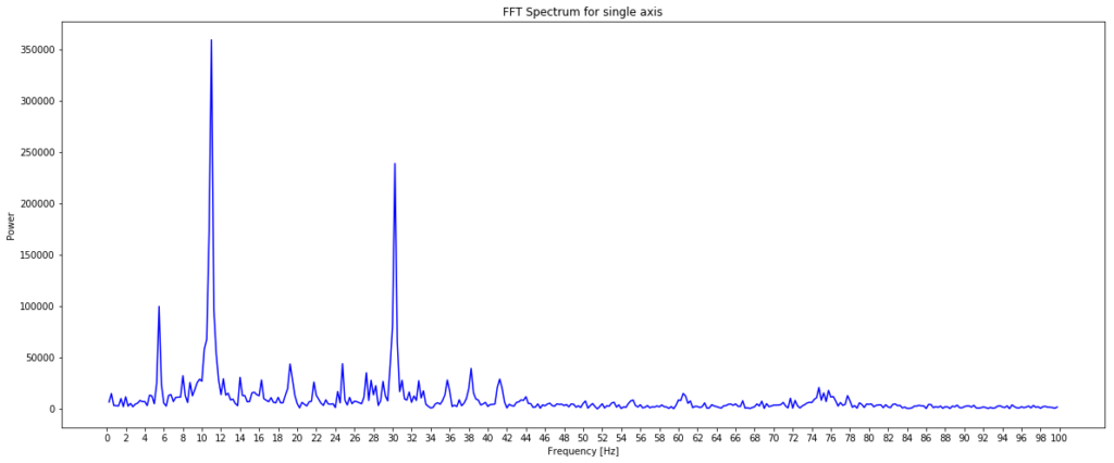
I was pretty excited when I saw this as the plot of power against frequency made sense. The large spike at around 11Hz aligned with the thump-thump-thump noise I could hear and the smaller, but still significant spike at 30Hz could well be the ‘normal’ operating vibration since the mains frequency is 60Hz. I’m guessing a bit at this since I’m neither a data scientist, a motor expert or an electrician, but it made sense to me. The important thing is that we have extracted a clear signal from the data that can be used to provide an insight.
